
The Goal
Create a visually compelling and well-organized persona layout for a UXD student at Kent State University (KSU). Academically, the goal was to showcase an understanding of typography, composition, and hierarchy and application of foundational knowledge in human perceptual, cognitive, and physical capabilities, especially regarding reading, attention, and motivation.
Who, Why, How, What
Who was the user?
Since this was a persona development exercise, the user in this case is a hypothetical KSU UXD student.
Why solve the problem?
While this was an academic exercise, in a real world scenario, the necessity for the persona development could arise out of the university administrators designing/refining an academic program focused on UXD. Another potential scenario would be if there is an organization which is trying to understand how to influence their product/service development based on the needs of the target persona.
How did we solve the problem?
The central theme to this development was the selection of a grid-based layout and appropriate use of color and typefaces to align with the ethos of the persona. The 3-column grid provided ample space for the persona’s various elements while maintaining a clean, asymmetrical composition. Key design decisions were made to enhance both the readability and usability of the persona layout:
- Grouping and alignment were applied strategically to reinforce the hierarchy, creating an intuitive and user-friendly document.
- Typography was chosen to establish clear visual hierarchy and help guide the reader’s attention to the most important elements.
- White space was utilized effectively to prevent visual clutter and ensure that the persona felt balanced and easy to navigate.
What was the solution?
The final solution is a well-balanced, professional persona layout that includes all the required information. This layout adheres to the principles of hierarchy, alignment, and white space, ensuring that each piece of information about the persona is easily digestible. By using these principles effectively, the layout communicates the persona’s details without overwhelming the reader.
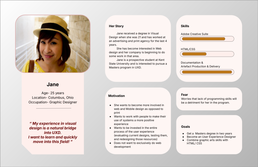
Process Deepdive
Grid System and Layout Choice
I decided to work with a 3-column grid system, which offered flexibility while still maintaining structure. This grid helped in organizing the persona’s various elements such as the title, biography, goals, challenges, and motivations. By leaving room for margins and maintaining an asymmetrical composition, I ensured that the layout felt dynamic and well-spaced.
Typography
For this persona, I used a mix of typefaces and weights to establish a clear hierarchy. The headlines were bold and larger in size, while body text was kept simple and readable. For the quote, I used stylized the font further with color and size to act as an focus point for the reader. The typography was chosen based on both its legibility and its ability to engage the user visually. I used clear, easy-to-read fonts that followed the principles of legibility, especially for those reading in print.
Visual Hierarchy
Hierarchy is crucial when presenting information in a persona. I carefully grouped information into sections to guide the user’s eye across the layout in a logical, smooth flow. Key demographic information appeared at the top left followed by the persona’s story, motivations, skills, challenges and goals. This created a clear visual path from left to right and top to bottom, ensuring that the reader could easily understand and follow the persona’s details.
White Space and Composition
One of the most important decisions in this layout was the effective use of white space. It allowed for a clean, uncluttered look, helping each section breathe and making it easier for the user to absorb the information. I intentionally left ample margins around the edges of the page to keep the layout from feeling cramped. This also allowed the content to feel less overwhelming to the user, particularly in a document that could be viewed in both digital and print formats.
Color and Contrast
For the color scheme, I kept it minimal with shades that ensured both legibility and visual appeal. The contrast between text and background was considered carefully to maintain readability, especially for those reading in print. Soft colors were used for section dividers to subtly separate content without overpowering the primary information.
Consistency
Throughout the persona, I made sure to maintain consistency in the design elements. The font choices, color scheme, and layout structure were uniform throughout the document, making the persona visually cohesive. This consistency helps establish professionalism and makes the persona more trustworthy and credible in a UX context.
Artefacts
The only artifact produced as part of this exercise is the persona graphic shared earlier.
Leave a Reply