
The Goal
To design a solution that helps individuals and small business owners track and receive timely reminders for replacing household and hygiene-related consumables—like batteries, filters, toothbrushes, razors, and dish pads. The goal was to reduce friction in routine maintenance by providing proactive, context-aware nudges that simplify replacement planning and ensure better upkeep.
Click here for a clicking through a prototype.
Here are the the comprehensive list of all deliverables produced in this project.
Who, Why, How, What
Who was the user?
Based on the user research conducted, I identified 3 primary personas as target users –
Primary Users
- First time homeowners
- Adults aged 35-50 who are responsible for maintaining a home
- Parents and caregivers responsible for family household management
- Tech-savvy individuals looking for low-effort solutions to household management
Secondary Users
- Property managers, Airbnb hosts, and Real Estate owners who are managing consumable replacements across multiple properties ensuring that critical maintenance tasks are completed efficiently.
These users often overlook or delay replacements due to lack of visibility or mental load, leading to inefficiency, hygiene lapses, or device malfunction.
Why solve the problem?
Time pressed individuals often forget to replace essential household non-food consumables—such as
- Batteries
- Filters
- Hygiene items (like toothbrush, dish sponge, diaper wipes etc)
Until it’s too late!
This is a widespread but often overlooked issue.This results in frustration, health risks, and avoidable disruptions in daily life. With each item having its own replacement cycle and no unified tracking system, these routine tasks are easily overlooked, especially by busy individuals with no/little mental bandwidth.
Household consumables don’t always give warning signs before failing, yet affect quality of life, hygiene, and performance. Users often resort to mental tracking or ad hoc calendar notes—methods that are unreliable and unsustainable.
How did we solve the problem?
The process centered on a design thinking methodology of running iterative cycles of discovery, problem definition, prototyping, testing and refinements. I started with exploratory user and market research followed by converging on the problem statement and iteratively designing towards the final state.
The exploratory research phase included –
- Surveys and user interviews to uncover user needs, habits and frustrations
- Competitor and SWOT analysis to assess the market scenario and define Cue’s differentiators
- Personas for individuals and rental business owners
The design phase included
- Drafting a design brief to outline the principle pain points, recommendations and design ethos
- Drafting of primary workflows hand-sketched wireframes
- Creation of a PRD (product requirement document) with phased product release plans
This culminated in the design of a hi-fidelity clickable prototype.
The testing and iteration phase included –
- Moderated usability testing
- 2nd design release of the hi-fidelity clickable prototype.
What was the solution?
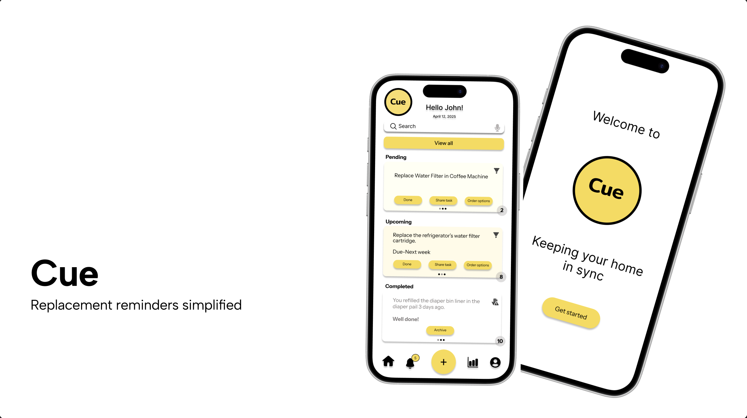
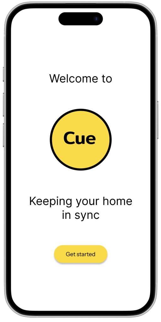
The solution was an app called “Cue” which is aimed to create a dedicated, intelligent solution that automates tracking and provides timely, relevant reminders, reducing cognitive load and ensuring users take action before an item becomes unusable or a hygiene issue escalates into a health concern.
Some of the features that have been scoped and built into the prototype are highlighted below
Highlighted features of Cue
- Calendar integration for silent non-intrusive notifications
- Personalized notifications/alerts tailored to user preferences
- Provides replacement buying options (of different brands & prices) from e-commerce platforms
- Delegate specific tasks to trusted contacts during emergencies through texts messages & emails
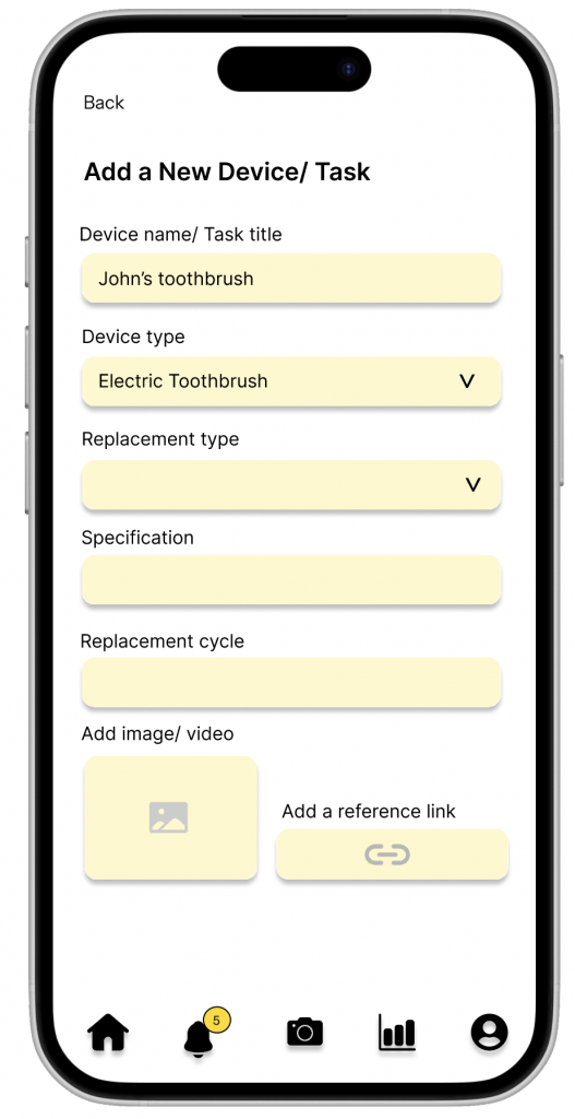
- You’ll have the option to include images, videos, or YouTube links when setting up a device or task—for easy reference later.
- Get data-driven recommendations based on your replacement item usage habits.
- Try Cue with limited access, guest sign-up available
Process Deepdive
Critiquing the Original Dialog Box
I began with mixed-method user research to understand the real-world habits, workarounds, and pain points people face when it comes to replacing consumable items.
- Surveys
A survey was conducted with 34 participants, targeting a mix of individuals and small business owners (e.g., Airbnb hosts). The responses revealed that over 70% relied on memory or scattered calendar reminders to track replacements—methods that often led to forgotten or delayed replacements. - User Interviews
I conducted in-depth interviews with 5+ users, including parents, renters, and Airbnb hosts. These conversations uncovered key patterns:- Users dislike “setting up” reminders from scratch for each item.
- People value peace of mind more than perfect precision—they want to know they won’t forget something.
- Airbnb hosts needed multi-property support and bulk tracking features.
These findings were synthesized into user personas, key user goals, and frustrations, which guided feature prioritization.
Defining Product Architecture
Based on research, I designed a relational data model where each device type (e.g., water filter, razor, air purifier) could have one or more replacement categories (e.g., HEPA filter, batteries), and each category could have specific replacement specs (e.g., “replace every 3 months” or “type AA battery”).
This flexible backend structure allowed Cue to:
- Handle diverse use cases from kitchen appliances to hygiene products
- Support advanced configurations for power users (e.g., hosts managing multiple devices across properties)
- Enable smart reminders based on estimated timelines or manual override
Designing Key Workflows
Three main workflows were defined based on user needs:
- User onboarding flow
- Calendar integration
- Notification management
Using these flows, I created hand-sketched wireframes, followed by mid-fidelity iterations that were validated internally.
Visual Design & Prototyping
Cue’s visual design prioritized simplicity, lightness, and mental clarity. I built a hi-fidelity clickable prototypes in Figma, incorporating:
- A clean, card-based dashboard showing upcoming and overdue items
- A guided flow for adding new devices with relevant replacement suggestions
- A reminder setup interface with smart defaults and repeat options
- Color palette and iconography designed to feel calm, helpful, and non-intrusive
All UI elements were designed with accessibility and scalability in mind.
Usability Testing & Iteration
I conducted moderated usability testing with 4 users, asking them to complete core tasks such as:
- Sign up and starting to use the app (onboarding)
- Checking reminder
- Setting up a new device
- Setting up calendar integrations
Thematic Analysis of the Usability Testing Results revealed the following
Positives
- Visually Appealing and Intuitive Design – Users appreciated the clean color palette and design elements that made the app visually readable and inviting. (U2, U4)
- Helpful Centralized Task Management – The homepage offering a centralized view of all tasks and devices was seen as practical and easy to navigate. (U4)
- Support for Diverse and Custom Devices – Users liked that they could track multiple types of devices, including adding custom ones, enhancing the app’s flexibility. (U4)
- Smart, Configurable Notifications – The notification system stood out for its customization, giving users control over how and when they’re reminded. (U4)
- Valuable Integration & Access Features – Calendar integration excited users for helping them stay on top of tasks. Guest mode was also appreciated for lowering the barrier to entry. (U4)
- Guest Access Lowers Barrier to Entry
- Several users valued being able to use the app without signing up, especially those who are privacy-conscious or just exploring.
Opportunities for improvement
- Onboarding and Sign-up Flow Gaps – Users wanted an intro screen to understand the app better and found the benefits of signing up vs guest mode unclear. (U1, U4)
- Task Management Limitations – Lack of task sorting by urgency/date, inability to edit/delete tasks, and unresolved completed tasks reduced usability. (U2, U4)
- Inconsistent Interface Interactions – Carets, dropdowns, and confirmation flows lacked consistency, frustrating users navigating across different parts of the app. (U2, U4)
- Poor Buying Option Experience – Users found the current buying interface lacking; they wanted filtering, sorting, and side-by-side comparisons to make informed choices. (U3)
- Information Overload or Irrelevance in Task Setup – Some users found task setup burdensome, with unnecessary specification fields and no help when unsure about
Artefacts
The following artifacts were generated as part of the project
User & Market Research
- Survey Results
- Survey Report Insights
- Interview Insights
- SWOT & Competitor Analysis
- Product Requirements Document (PRD)
Design
- Design Brief
- Visualization of 3 primary workflows (Follow outline on Mural for navigation)
- Hand sketched Wireframes
- Technical Feasibility Assessment
- Clickable prototype on Figma
Leave a Reply